sonder
magazine layout & mobile web
Category | Page Layout, Photography
Industry | Editorial, Travel
Personality | Young, Adventurous, Inquisitive
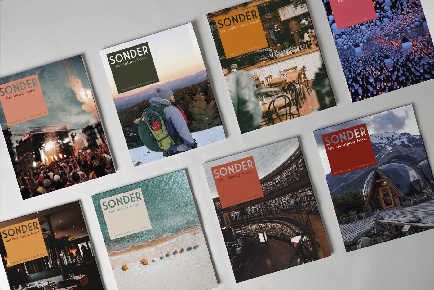
overview
What it's all about
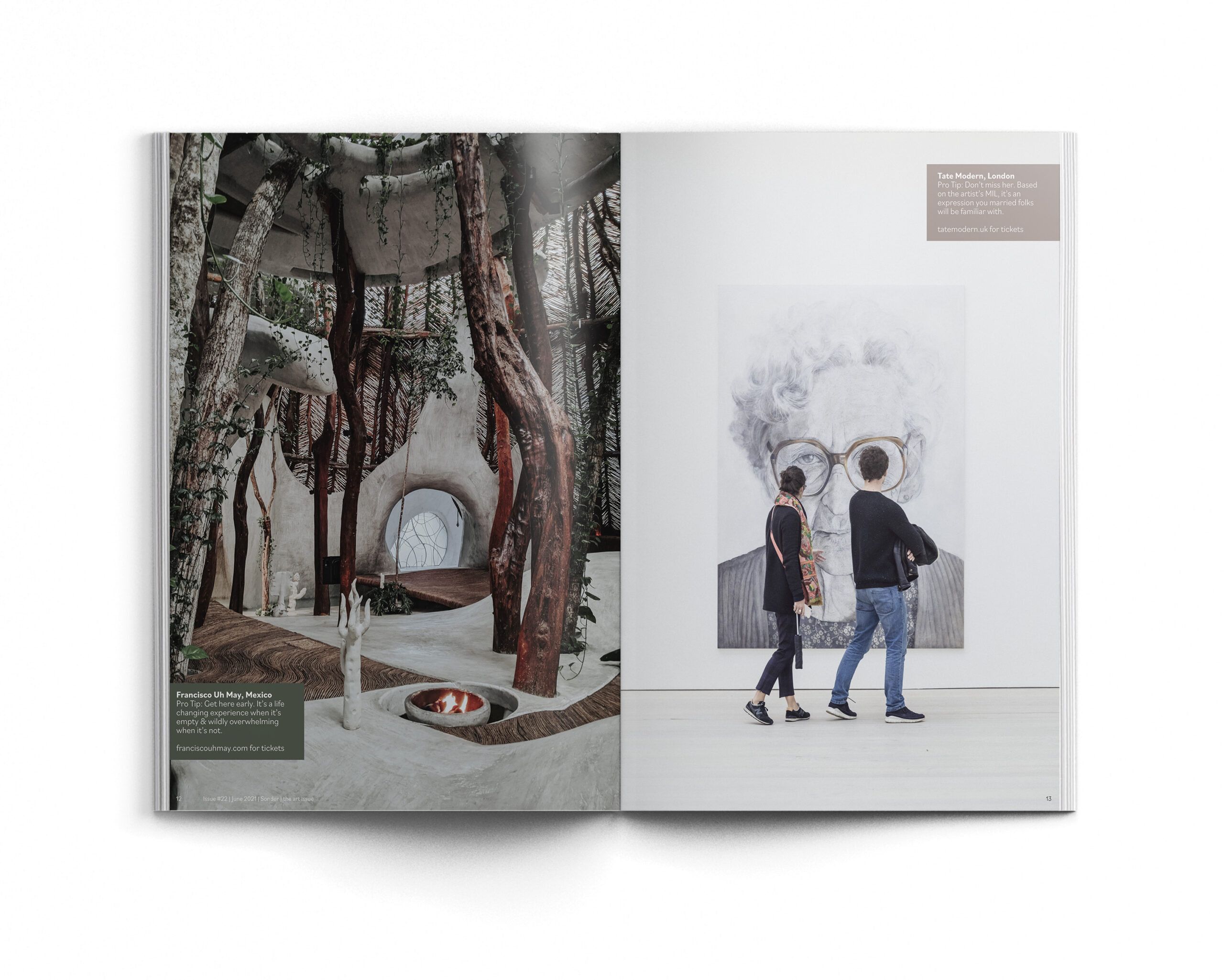
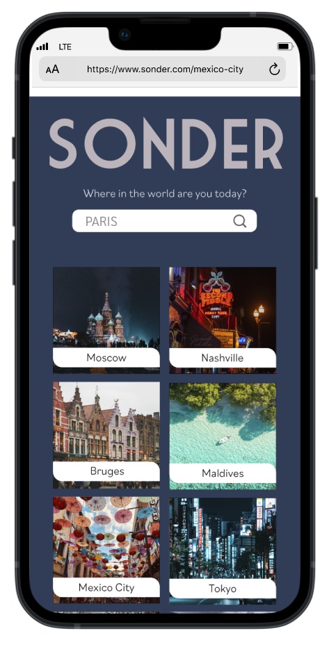
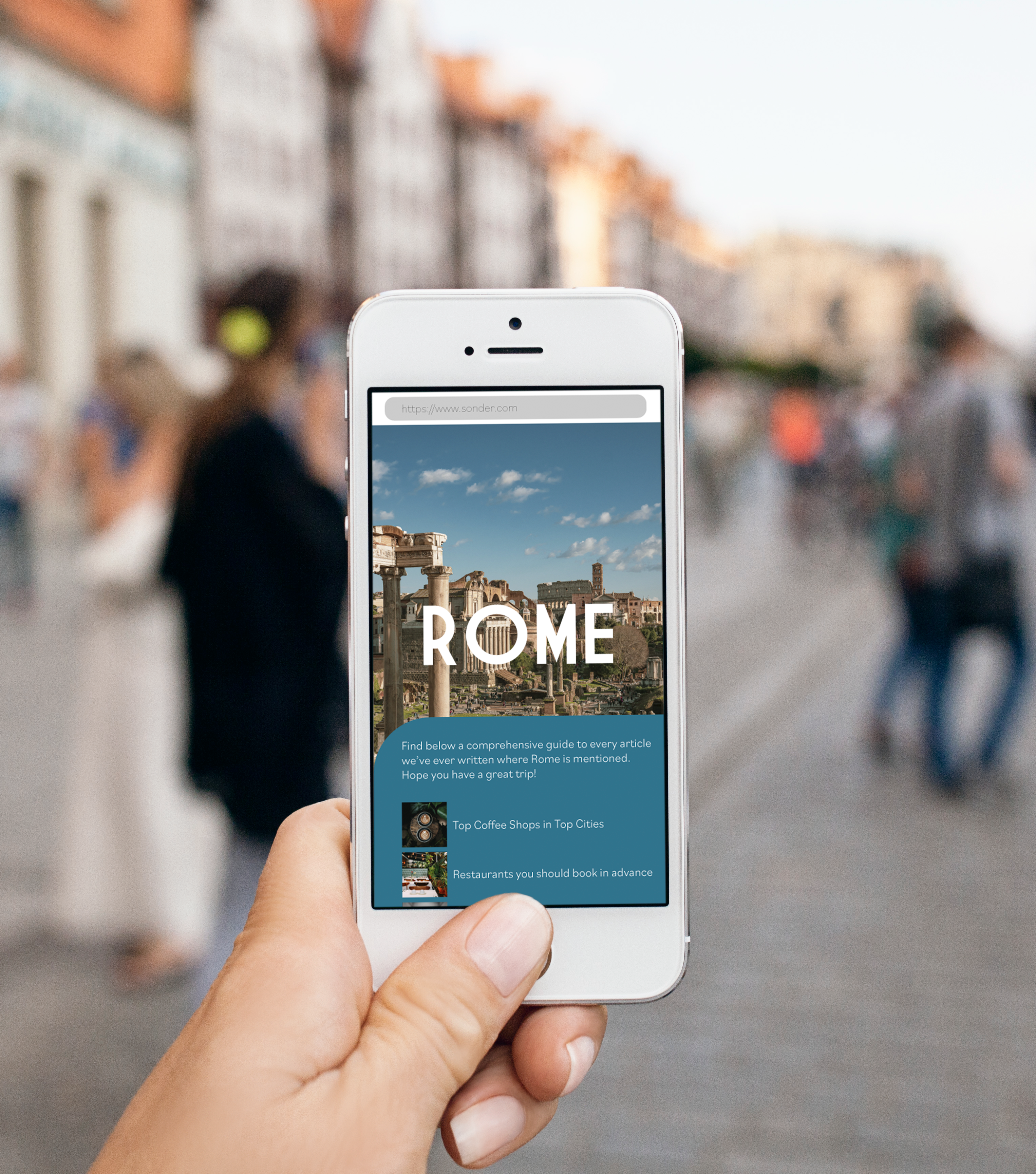
Sonder is a travel magazine with a corresponding mobile site aimed at young adults. It is released 4 times a year, and each issue has a different theme. The idea is that you can be inspired by themes within the magazine, and then use the functional and searchable website to narrow down existing articles by city once you’ve chosen a destination. The photography is bright and detailed and takes center stage, while web navigation is simple and allows for planning easily.
how we did it
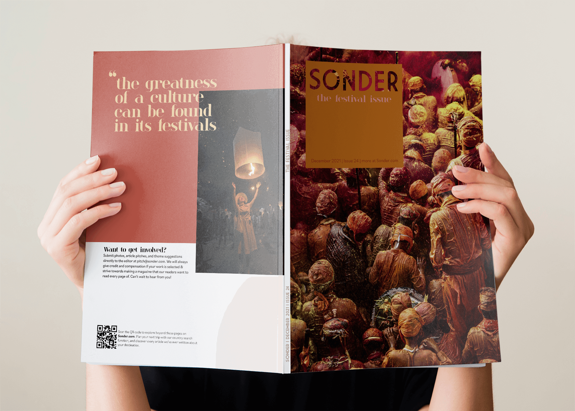
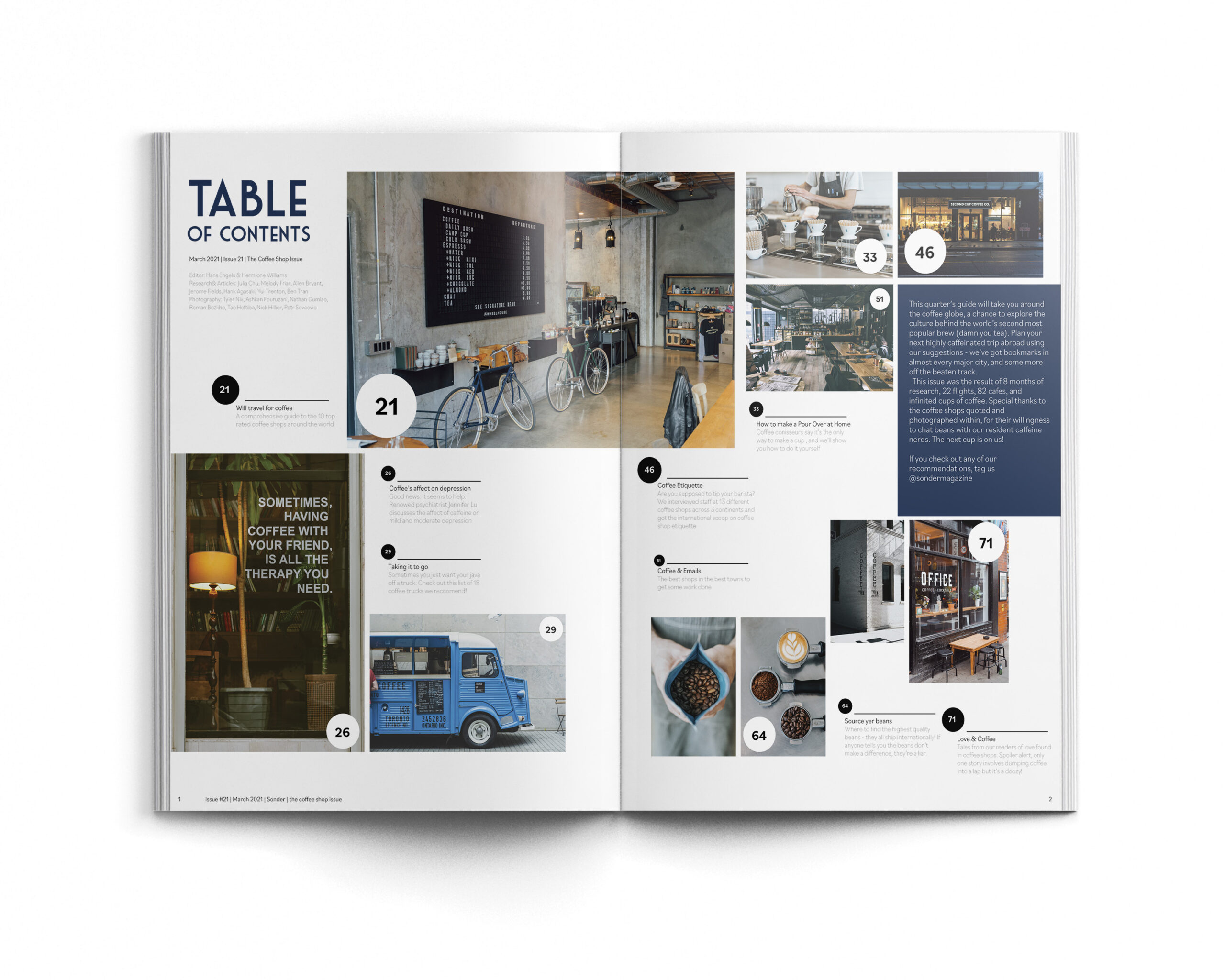
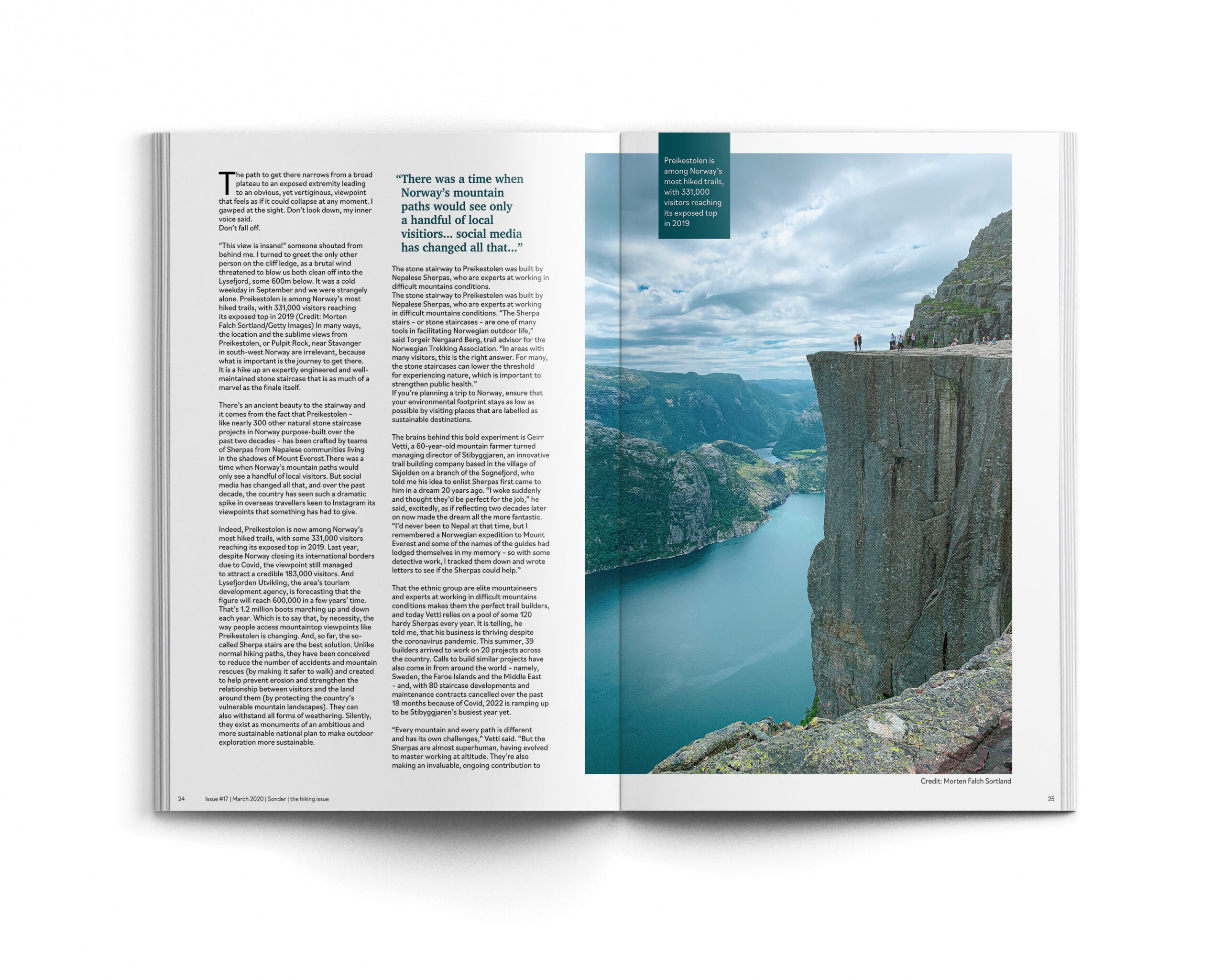
We put a lot of emphasis on the quality of the featured photography, as well as the interest captured via each article. Our target audience is young adults who spend a lot of time interacting with screens and are comfortable planning things in a digital space, so the goal was to maintain the sanctity of print while also taking advantage of the ease of search within a digital compliment to the magazine.
magazine
mobile website
get in touch
barbarasangster.design@gmail.com
words & images © 2025 barbara sangster
