
Albertsons
corporate rebrand & web redesign
Category | Web, Print, Brand Research
Industry | Corporate, Retail
Personality | Accessible, Family, Neighborhood
overview
What it's all about
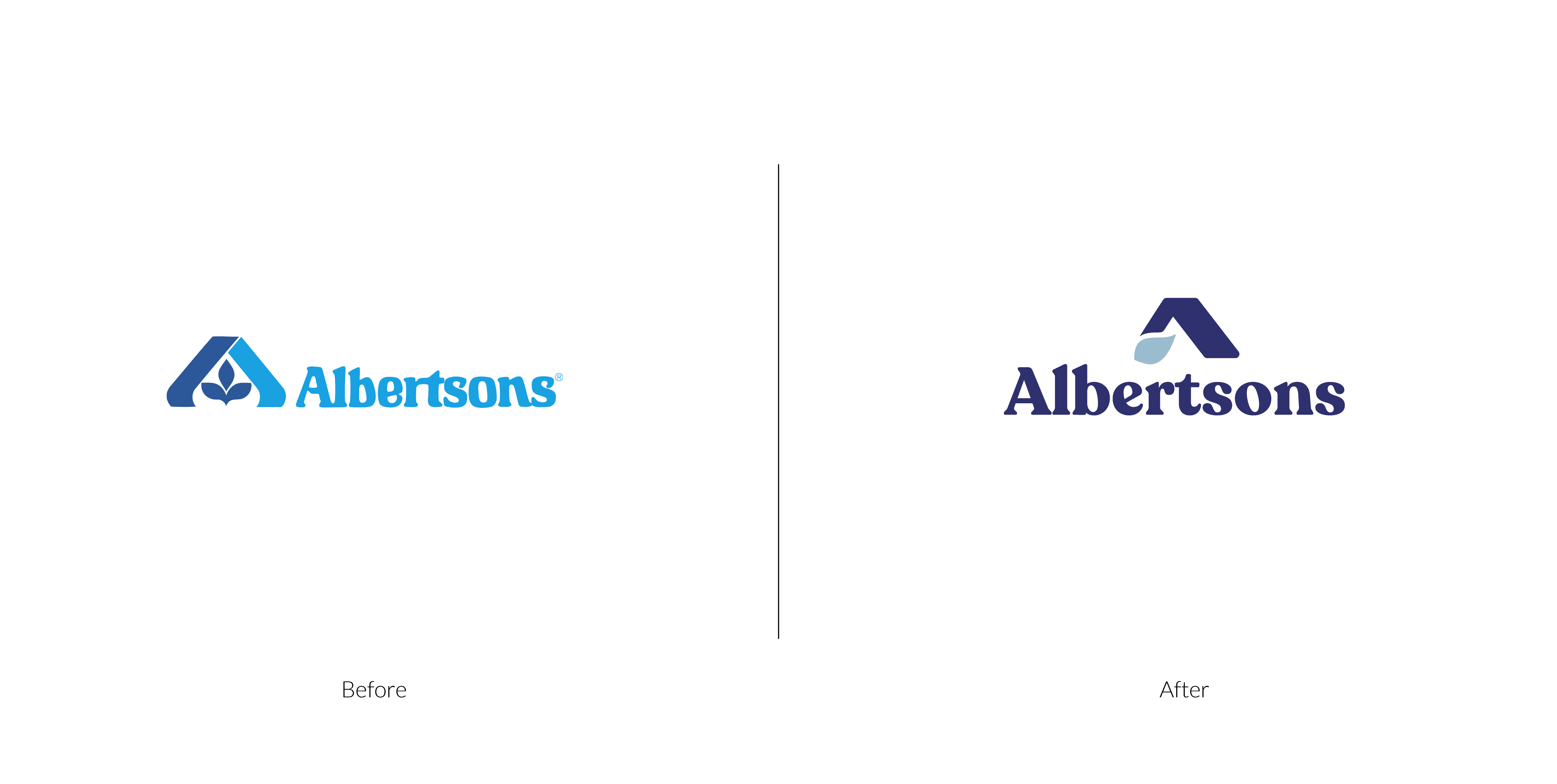
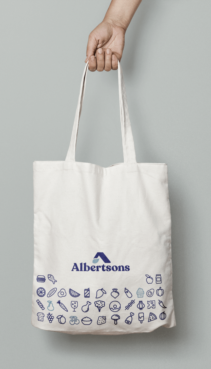
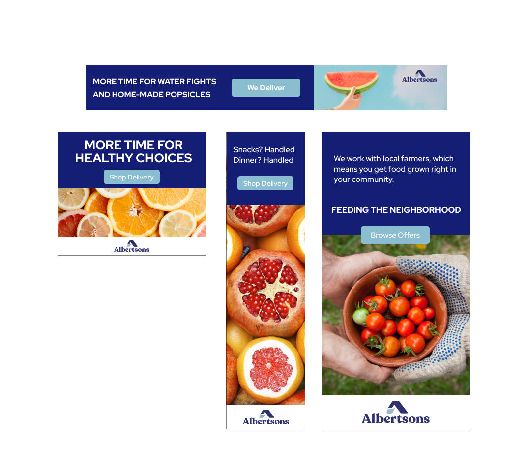
Albertsons is a US-based grocery store founded in 1939 in Boise, Idaho. It's gone through a variety of mergers and acquisitions but maintained the same look and feel since 1973. This rebrand focused on taking a big step forward in terms of positioning and modernizing. Delivery, accessibility, and focus on locally grown products take center stage.
how we did it
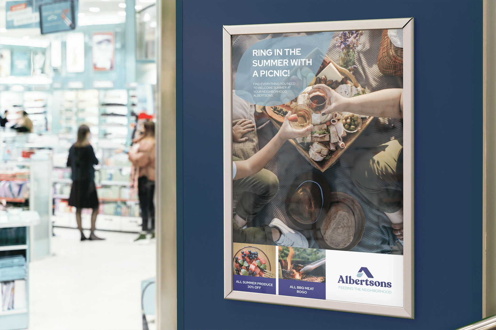
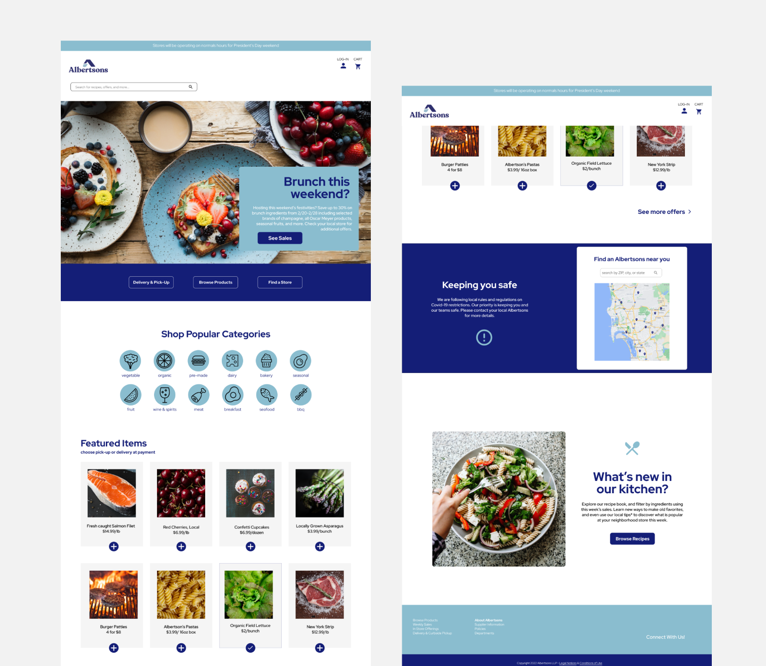
The logo was completely rebranded, and colors were upgraded while ensuring that brand recognition was not lost. The website was upgraded with a clean lay-out, beautiful photography, and a focus on the delivery service offered by Albertsons. The compostable grocery bag design was updated, and banner ads got a refresh as well.
Website
Brand Audit
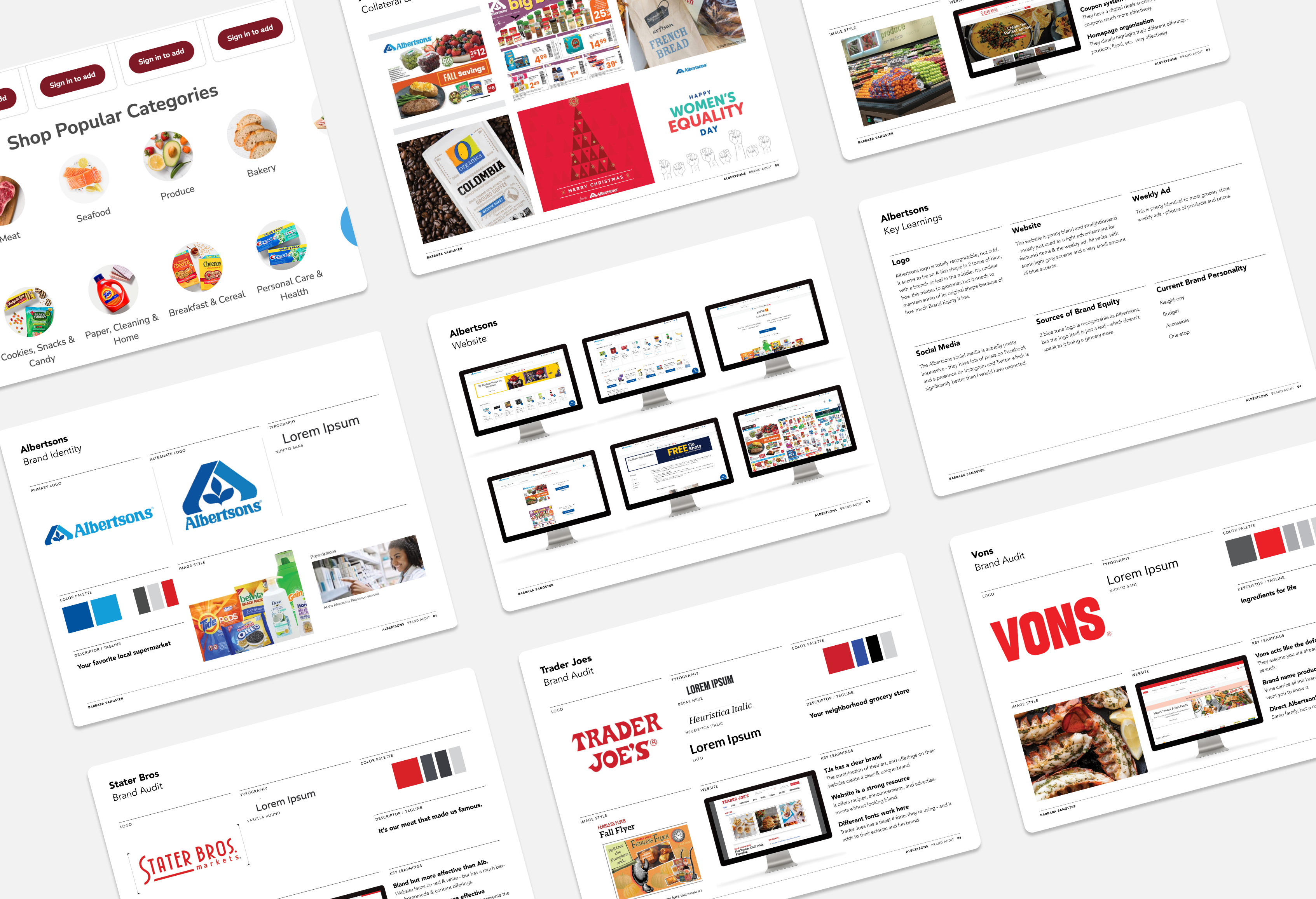
Collateral
get in touch
barbarasangster.design@gmail.com
words & images © 2025 barbara sangster